Jun 10, 2009
Jun 05, 2009
D&AD Awards
Right then. Seeing as it's the awards ceremony on Wednesday night, what do you think of the D&AD Awards?

Straight off the bat. Are they too expensive? Too cheap? Very prestigious? Not enough designers win? Too many designers win? Same old people win? Couldn't care less?
Let me know in the comments.
Jun 04, 2009
#fontsongs

Image thanks to David Zülke.
This afternoon Matt twittered

That bit with the hash symbol is called a hash tag. It's a little thing which makes it really easy to search Twitter for particular subjects. Conferences love them. Humans use them when discussing TV programmes, #apprentice or #bbcqt for example. They are also used for memes.
Matt may not have been the first to use that tag, but he's the first one on the Twitter search. (Twitter won't let you search people who have made their tweets private.)
So. Where were we? Oh yes. I replied/

Jeremy and Iain.

 Richard even had his retweeted by the Britney Spears fan club.

And before we knew it a meme had been created. Someone should tell Robin Wight.
Currently there are over 300. Here are some of my favourites:
Nights in Wide Latin
Sweet Tahoma Alabama
Across the Univers
Wind Beneath My Wingdings
We Have All The Times In The World
Don't Believe The Type
I'm So X-Heighted
Sweet Tahoma Alabama
Across the Univers
Wind Beneath My Wingdings
We Have All The Times In The World
Don't Believe The Type
I'm So X-Heighted
You can see them all here.
Jun 01, 2009
8x8 London
You know those Pecha Kucha nights that always sound like such fun? The people at ilovedesign.com are putting on a similar event called 8x8 on 1st July. This one might even be better as 8 creatives have just 8 minutes to talk about what inspires and motivates them. Nice and fast paced.

The speakers are all great and a lovely mix of digital and traditional. Some big names and people you might not have heard of. But you'll be familiar with all of their work. I know a few of them well and I'm really excited about the evening. Doubly excited as I'm going to be hosting, so I can fulfill my life's ambition to be Chris Evans/Terry Wogan/Ant & Dec/Simon Amstell.
You read that right, I'm hosting the event. Please leave any good design jokes in the comments. I'm gonna need them.
It's on 1st July, it's a bloody bargain at £15 and you can buy tickets here.
Here's the full list of brilliant speakers.
1. Iain Tait, Creative Partner at Poke (you all know Iain, right? The best dressed man online.)
http://www.pokelondon.com
2. Vaughan Oliver (yes, Vaughan Oliver!)
3. Joel Gethin Lewis & Pete Hellicar (Joel used to be at UVA, I shared an office with him and Pete earlier in the year, very clever guys)
http://www.hellicarandlewis.com
4. Richard Hooker, Designer and Art Director at Wieden+Kennedy (I've worked with Richard and he's an amazingly talented designer, you'll be very familiar with his work)
http://www.wk.com
5. Matt Dent (coins, you all know the coins)
http://www.mattdent.com
6. Alex Bec & Will Hudson, Co-founders at HudsonBec (keep your eyes on this lot, they're gonna be big)
http://www.hudsonbec.com
7. Jamie Wieck, Designer and Illustrator at Airside (OK, I don't know Jamie. But - Airside.)
http://www.airside.co.uk
8. John Bateson (I don't know John either, but again - Roundel.)
May 28, 2009
Two planners in a room
I have no idea what the APG is, really.

It stands for the Account Planning Group and as far as I can tell is a bit like D&AD but for planners. Winning the Grand Prix is just like winning a Black Pencil. To win a Grand Prix, or a Gold or a Silver, you have to write a 2,000 word paper describing the rationale behind a piece of your strategy work.
Most people write these papers over several weeks, with 3 or 4 drafts.
Two planner friends of mine, Paul and Doug are entering the APG this year. They haven't written a single word yet. And the deadline is tomorrow - at noon.
This isn't down to their laziness or inefficiency. This is because they're writing about the something (can't tell you which client) where the strategy behind it was that people perform better under pressure. So they are going to write the paper in just 24 hours, live on a webcam. To place them under pressure.
Good, eh?
You can help by increasing the pressure and watching them live over at Two Planners In A Room. The more pressure they're under the better the idea becomes. So spread the word.
May 25, 2009
Sometimes I love this profession

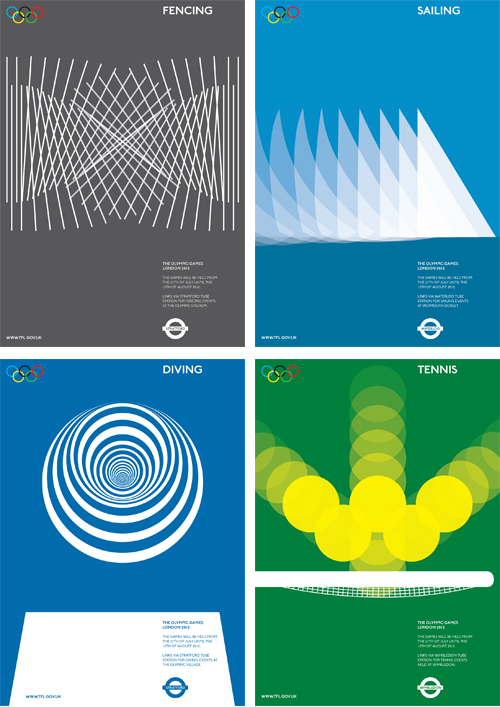
And then there are these things of exquisite beauty by Alan Clarke. Wonderfully evocative. Bright, fun, exciting. Simple and yet complex. The kind of thing you'd buy and stick on the wall.

Graphic design at it's best. Lovely.
I think Alan is a recent graduate, but I may be wrong. Sadly these posters are only speculative and not actually for the 2012 Olympics. But if someone from Tfl or LOGOC is reading you should give him a call, right now. (Or maybe tomorrow, after the holiday.)
Sometimes I hate this profession

I despair when I see stuff like this, and you see it everywhere. Does that building really need all those signs? Do they have to be so ugly. Does that huge slab of space have to be made so aggressive and so intrusive by the addition of graphic design?
There should be some humour in there, a light touch to make passers by smile. There is an opportunity to do something with half a street for God's sake! Failing that (and that's a tall order admittedly) just keep it simple and quiet. One sign would be enough. Two at a push.
Sure, it may not be the designers fault. Maybe the site manager just ordered 12 signs. But someone should have considered the context. Someone should have stood back and thought for a minute. That someone, in my opinion, should have been the designer.
This is nothing new. You see this everywhere, all the time and you always will.
And then there's this. You see this everywhere too.

That's the logo for a company called 'design clarity'. Design. Clarity. So fucking clear you can't read the bloody sign because they put the logotype through a shredder.
I don't know if that's supposed to be ironic or even a joke. I think it's just shit. And wrong. And a little bit depressing. There's nothing worse than designers trying too hard to be clever.
But anyway.
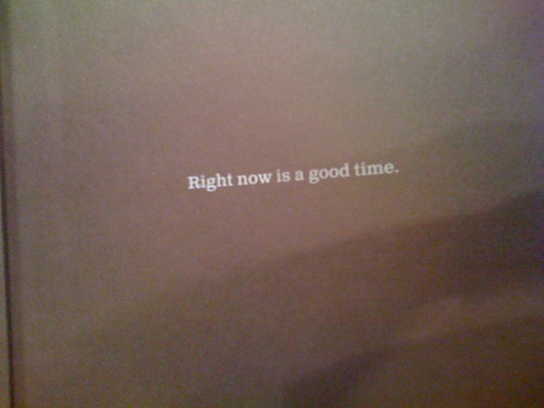
May 22, 2009
Nice typography

That's a bit blurry because I've enlarged the picture below. The picture below is the scene, the picture above is how my Design Disease mind framed it.

May 20, 2009
Is anyone sitting here?

It's the D&AD Awards night on June 11th. A few of us realised we were going but not as part of a large group. To avoid having to sit next to some blithering idiot we arranged to sit together.
So Mike Reed, Matt Dent, myself and a few others will all be sitting round one big round table. Matt's even gone to the trouble of being nominated. There are 6 spare seats and we wondered if there are any other lonely souls who'd like to sit with us. There are no entry requirements, you can work for a big corporation, you could be a freelancer. If you don't fancy the possibility of sitting on your own, then drop me a line and we'll sort something out.
May 17, 2009
Things My Friends Are Selling On The Internet
Anne has made these lovely greetings cards from her lovely pictures. Her photos always seem to have amazing light. You can get a set of four different cards for £8, including postage - that's better and cheaper than Scribbler. You should buy a set.

Schulze & Webb have made these amazing maps of New York. A horizonless projection of Manhattan looking uptown from 3rd and 7th, and downtown from 3rd and 35th. You can read more about it here.
They have a limited number of prints available to buy and they're selling fast. £40 for two limited edition, hand numbered prints is pretty good if you ask me. You should buy a set.
May 14, 2009
Thinking Digital: Perfume Dinner
Warning: a post not about graphic design.
I'm in Newcastle right now for the Thinking Digital conference, which we're speaking at on Friday. Right after Hans Rosling. No pressure.
Anyway. Last night there was a dinner for speakers. This was billed as a 'Perfume Dinner'. Whatever that means. I'm familiar with the film and the book Perfume (Grenouille and all that) so I was interested to find out if we were all going to be horrifically murdered.

No one was murdered.
Hosted by Chandler Burr who's the perfume critic at the New York Times (I'm not making this up) it was a fascinating evening with a lot of science. In a good way. It's basically a 7 course meal interrupted by scent. Each course of the dinner was preceded by the corresponding smell. For example we smelt some carrots before this lovely carrot soup.

We smelt synthetic scents and natural scents, we found out which popular scents are in which perfumes. How the big perfume houses operate (clue: there's lots of money in it). A perfume 101, if you like. A fabulous, interesting evening.
Chandler would get us to smell something which no-one could quite place and then as soon as he revealed the source we were all taken straight there.

I'm not really getting across how powerful it was. But we all know how a certain smell can take you right back to a particular memory instantly.
Right at the end we smelled, individually, lime, vanilla, cinnamon and clove. We were getting good at guessing the smells by this point, so most people got these. Chandler asked us what all these scents together would make. We had no idea.

Then we placed all four sticks together took a sniff - Coca Cola. Pretty amazing.
I learned a lot. You can't say that for most speakers dinners.
May 10, 2009
Music to design to

Alistair would like to know "your three top albums (in order of preference) for designing to". Why don't you pop over and tell him?
May 07, 2009
The 7 Habits Of Highly Effective People I Know

You will all be familiar with the book The 7 Habits of Highly Effective People a "framework for personal effectiveness" no less.
Recently I've spotted that people I have worked with or met over the years have all shared similar 'habits' So I've decided to write The 7 Habits Of Highly Effective People I Know.
Some of these people are Graphic Designers. Some of them have absolutely nothing to do with Advertising or Marketing. Some of them are friends, some of them I have never met but have followed closely enough to be able to add them to this list.
By highly effective I really mean successful. 'Successful' is a loaded term. In this post I shall use the word liberally, as I see fit. 'Successful' is entirely determined by me. Successful might, but does not exclusively, mean being rich or being at the top of your profession. It also might mean being, in my opinion, a brilliant Dad or a brilliant Mum or just being a jolly good egg.
The kind of person you look at and think, 'I wish I was more like that'.
As Tarik points out in this brilliant and introspective post it's very easy to "fall in with the wrong crowd". It's just as easy to surround yourself with successful people and pick up some good 'habits'. The older I get the more I realise how often success is not an accident. It's frightening how early on it is determined and how easy it is to replicate.
And now on with the post.
Habit 1: Be Early: Principles of Personal Time Management
There's no getting away from this, the evidence is everywhere. If you want to be succesfull you need to be earlier.
Successful people get up early. They start work early. You could do that.
They arrive early. They realise that being late isn't OK. They realsie that the old adage "it won't matter if we're 5 minutes late, if they like the work they won't remember that" just isn't true. People remember if you're late.
But they also start stuff early. It's so much easier to finish a project if you've started early. That's a basic truth you're taught at school, but it's still very true.
Habit 2: Never Be Faux Busy: Principles of Personal Awareness
I used to work at a place where we had an account manager who started every sentnece with "I'm soo busy..." whether she was busy or not. You know the type. We use to call this faux busy. As in "I'm faux busy".
Everyone is busy. Everyone. Everyone has their own personal definition of busy. You're busy is different to Barack Obama's busy, but it's still busy. Succesful people have the humility to realise and respect other peoples busy and so never complain about being busy. They don't waste precious time flapping around claiming to be faux busy.
The busiest people I know can always find time for me. But then maybe that's because they've started stuff earlier...
Habit 3: Know When To Say No: Principles of Integrity & Execution
Saying No is one of the powerful tools you have. You should try it. Successful people don't say yes to everything. They don't go to every meeting. They don't take on every project. They pick and choose carefully. And if it's looks duff, they say No. Not maybe, but No.
If you've ever said No to a client, for the right reasons, you'll know that the relationship almost always benefits.
Habit 4: Be Generous: Principles of Mutual Benefit
Successful people are generous with time, money, trust and everything else. They know that they'll reap the rewards of what the give away. They're not afraid to share and they're not scared of trusting others. They don't micro manage. They trust other people to do a good job.
When you do that, you'll generally find that other people can be trusted to do a good job.
Habit 5: Learn To Compartmentalise: Principles of Mulitple Tasks
Politicians talk about this a lot. Compartmentalising means that you can leave a stressful job behind and not take it out on the kids. It means you can enjoy the weekend. It means you can be angrily terse with a courier who has fucked up and then charmingly loquacious in an employee review.
I was once advised that if ever I was having a bad day at work, when I left I should visualise a big heavy door closing and then locking behind me. It won't open again until I get back to work the next morning. You should try that.
Habit 6: Write Often and Write Well: Principles of Creative Writing
Odd but true, all successful people can write well. And I don't (just) mean blogs. I mean proper writing. There was an interview with Paddy Ashdown in the FT t'other day. In that he mentioned that he'd always written. Even when he was younger he used to jot stuff down on bits of random paper. Now he writes at airports - everywhere.
Writing is part of being able to articulate a point of view. Do you write?
Habit 7: Take Lots of Time Off: Principles of a Balanced Life
There was an article in The Economist a while back about how the best US presidents worked the least hours. (Bush used to to take loads of holidays, but he increased his tally by always working very long days.) Obama doesn't start work until the kids have gone to school.
As I've mentioned many times before the reason successful people can do more stuff is exactly the reason they are successful. They are better at getting stuff done. They make the best use of their time. They don't waste a minute. They know that an hour off is as important as an hour working. Successful people go on holiday. You should do that.
May 06, 2009
Some news
There's a conference on Friday at Central Saint Martins. It's been organised by some of the students and the proceeds go towards the cost of the final show. And for those of you who find conference expensive this one is only £8 for the whole day. Get yer tickets here.

And yes, yes, I'm talking. But I'd go to hear HudsonBec. They're a terrifically talented duo creating all sorts of exciting work and they're the brains behind It's Nice That. Should be a good day.

And there's more next week. I'm very excited about Thinking Digital, an event over three days in Newcastle. Again, there are some great speakers including Mike Southon from the FT, Matt Mason author of The Pirates Dilemma and Erik Huggers the Director of BBC Future Media & Technology.
We'll be speaking at that and hopefully we'll have some new news. Something I'm pretty excited about. All will be revealed next week.
Until then, let the music play on.
May 04, 2009
Orange and blue

The other day we visited the Butterfly Jungle exhibit at the Natural History Museum. My expectations were low.
I was wrong. It was fantastic. Amazing. 2,000 butterflies flying around, landing on you and generally being beautiful.

And it was a powerful reminder that nature has all the best colours.
Apr 29, 2009
AUSTERITISE YOUR BRAND! How Top Brands Maximised The Biggest Depression Since The Babylonian War Using Graphic Design, Branding, Marketing, RFID and SEO - a conference 2015

A bad packaging designer, 42, said yesterday, "We realised very quickly that the customers values had become misaligned with the core values of the brand. Extensive research found that users no longer wanted premiumisation in a period of economic woe. Even the key ABCDE demographic spurned premiumisation for simpler, basic (but still luxurious and aspirational) brands.
We looked at some of the post war creativities and began an extensive redesign of the core range. First we removed all serif fonts - sans serifs are considered cheaper and more basic. Then we took off all foil blocking which frankly customers felt alluded to an offensive debauched era. Lastly we made the tough decision to make all packaging two colours, thus giving the impression we had only used half as much design time.
We call this Austeritising Your Brand and we believe we can increase sales by up to 110% using this approach."
Apr 28, 2009
7 ways to be a Graphic Design student online
Speak to any graphic design tutor and there's lots of talk about how students are blogging and flickring and twittering. One small problem. It's not true.
Which is a shame for many reasons. Not least that your professional life is going to involve you having to understand all of this stuff. And the best way to understand something is to do it.
And as Sian (Graphic Design, University of Wales) put it the other day, "I think that it is important for graphic design students... to enter the world of blogging... It’s great to see what other students and other designers are looking at. It’s all part of the learning process."
And not only that, it's so easy. Easy, and most of this stuff lends itself to a graphic design course. Think of it as some cheap module scores. For example, imagine you're writing an essay about the Rosetta stone (you're all doing that right?). You'd probably start by Googling it. Every decent result you've found, add it to delicious. Even if you did nothing else on that essay you'll very quickly have a small collection of useful stuff.
Imagine if you wrote a sentence about each of those results. Stuck that on a Tumblr blog. Before long, the essay has written itself. See what I mean? It's a gift.
So to help a little bit, I thought I'd write a small guide to being a graphic design student online. It's not definitive and it obviously focuses on services I'm familiar with. But hopefully it makes sense. So, in a very particular order.
1. Flickr

If you do nothing else, you must set up a Flickr account. There can be no excuse. If you were on my course, I'd fail you for not having a Flickr account.
Flickr is the most graphic designery of all the social networky stuff. (It's a whole website of images for fucks sake!)
Put your photographs up there. All those photos of signs you take. All the blurry experiments with colour and light. Get them up there. When I has at college we used to have to keep a photo log book, where we'd have to jot down every exposure and setting for each picture we took. Digital cameras do this for you, it's called exif data. So, upload your pictures to Flickr and there's another job done.
Images are such a major part of a graphic design course and everyone now has the ability to take and make images quickly. (You've all got camera phones, I've seen them.)
But more than that. When you're working on a project upload every stage to Flickr. Let others, from around the world, comment on your ideas. Build on them. When you have to hand in your workings, point the lecturers to Flickr.
Stick your best work up there, organise your work into sets and you can use it as an online portfolio when you go for a job. a million times better than a 10mb PDF.
And it's free.
(There are other sites available. You could also use Deviant Art or Picasa.)
2. Blogging

To blog or not to blog? I can't really answer that. You need to make that decision on your own. The one thing I can say, is that you need to give it a go.
If Flickr is about pictures, then blogging is about words. Graphic Design courses involve a lot of words too. You could stick your whole dissertation up there. A little bit at a time. You could just post random notes and thoughts. Quotes you find. You could document projects you're working on, like Katie (Graphic Design, LCC) and Tom (Graphic Design, UWIC) do.
You could use it as a project diary. Once again, do a little, often and the project will finish itself.
Try to avoid Blogger. I use and recommend Typepad, but I understand that Wordpress is easier to customise and has nicer templates.
3. Tumblr
Tumblr is like blogging but easier. If you're not great with words, then Tumblr is for you. It's a sort of micro blogging service and lends itself to lots, quickly. I don't really like it, but it's a great way to start blogging. And yes, it's free.
4. Twitter
Twitter is like a micro version of micro blogging. A way to publish snippets of text that are no more than 144 characters long. So try that if you're even less of a word person than the Tumblr people. Twitter is very hard to describe, probably the easiest way is to say it's like the status updates on Facebook. It's also a really simple way of outputting text and linking the physical and the digital. Take a look at the Tower Bridge twitter stream and the Albion Bakery Fresh Buns alert twitter stream. Seriously.
5. Facebook

You're all on Facebook, right? Good. Let's see how you could use that for college and not just just pictures of debauched nights.
Kate Andrews (Queen of Networking) sets up and joins lots of interesting groups of Facebook. For example the Kept group, the Design Observer group and the 2gether09 group. You can join them. You can interact with people. You can meet other students and designers. You can become part of a community.
This kind of stuff may seem frivolous but it will be invaluable when you're looking for a job, or even just popping down to London for the D&AD student awards. And then you can upload all your pictures of that debauched night.
6. Delicious

I've already mentioned this above. Delicious is the ultimate Dissertation Building Tool. It's like essay writing for procrastinators. The first thing I do if I'm asked my view on a particular theme, like say tangible digital is look at my relevant delicious tags and instantly I've got lots clever stuff to say and reference. Your dissertation will write itself. Or your money back.
7. RSS Reader

Blogs. You need to read them. Everyone has a blog now. Even Michael C Place has a blog. These day you can follow your design heroes almost daily. That's a wonderful thing for those of us who had to make do with yearly Graphis updates when we were at college.
But following all these blogs is hard. The posts come think and fast. The bookmarks folder gets full up. That's why you need an RSS Reader. All blogs have an RSS feed. An RSS Reader graps the feed and chucks your blogs into one reader, one website basically. Like this:

RSS Readers are not scary. They are good. They are to be embraced. I use bloglines but you can use Google's of NetNewsWire or one of the hundreds of others.
And so there you go. You have no excuse now.
Oh and let's not forget Ffffound, inspiration on tap.
Apr 27, 2009
The Art of Penguin Science Fiction
I've just had an email from James Pardey who sent me a link to his wonderful website. The Art of Penguin Science Fiction.

Rather than me witter on for ages, let us hand the microphone to James who will witter on for a bit about this fab project.
"The purpose of the website is to complement a series of articles I've written for the Penguin Collector's Society on the history and cover art of science fiction published by Penguin Books from 1935 to 1977.
The website is primarily intended to be a visual experience (there are over 150 Penguin sf covers, which Penguin has granted me a licence to use) with the articles going into more detail about the sf itself, and the connections between sf and twentieth-century art (abstraction, surrealism, Pop, etc.) which is my main area of interest. This linkage between sf and modern art will also be the subject of some talks and further articles in newspapers and magazines that I am now planning.
My main area of interest is the linkage between modern science fiction - by which I mean Jules Verne and H G Wells onwards - and twentieth-century art (abstraction, surrealism, Pop, etc.).
Where Penguin comes into this is that in the 1960s they launched an sf series with covers by the great Germano Facetti. But instead of using pictures of aliens, rocketships, and bug-eyed monsters, Facetti chose reproductions of paintings by Max Ernst, Paul Klee, Yves Tanguy, Joan Miro and Rene Magritte to name a few. Why? Well, each painting was carefully chosen to tie in with some aspect of the novel, and it is these connections that form the heart of the website and the articles that I've written to accompany it. The articles are being published by the Penguin Collectors' Society (last December and two more due this year) but the articles and website only go so far.
There is more to explore, such as the links between J G Ballard and surrealism, Jules Verne and the Belgian surrealist Paul Delvaux, Delvaux and Ballard, etc., etc. I am therefore planning to examine this in some talks and further articles for newspapers and magazines. Incidentally, instead of starting in the 1960s I decided that both the website and articles should start at the beginning, when Penguin was founded in 1935.
I did this in order to tell "the whole story" since the early orange-and-white banded covers of Penguin books have since become regarded as design classics and, to many people, miniature works of art in their own right. And after the sf series in the 1960s, the influence of Pop Art and Op Art can be seen in the later Penguin sf covers by Alan Aldridge and Franco Grignani, while those by David Pelham have also achieved iconic status. Facetti was no stranger to sf either, as he appeared in La Jetee, a seminal art-house sf movie by the French New-Wave director Chris Marker."
Apr 24, 2009
Revival Conference
Today I spent a lovely day at the St Bride Foundation. (Or St Bride's Library, I'm never sure which.)

I was speaking at the Revival Conference. But enough about me.
The conference was really good. And not because the coffee was good, or the venue was good, or the speakers were polished eloquent speakers - because it had talented people talking about one thing. Graphic design.

These pictures are from David Pearson's talk. I don't need to explain who he is, do I? He talked about lots of things, but one thing I liked a lot was this collection of covers he found in the Penguin archives which all feature circles in the design. There were hundreds of them.


That's Tom Harle, by the way. Far left, purple jumper. Back to the circles.


Another highlight was Yulia Brodskaya who spoke about her gorgeous typographic paper quilling. She even discussed the best way to light them which was good. Good graphic design chat.


There were lots of other good bits.
Kath and Julia from johnson banks were good and it was nice to see some more detail about their work.

I think that's Kath and Julia. It might be Julia and Kath.
And this chap, whose name escapes me, who read through Paul Stiff's paper, because Paul was ill. Anyway. Some great stuff about the earliest tariff documents and distance maps for taxi drivers. Fascinating and with some great maps.

This map is from 1850 something. It has circles at half mile intervals. That way it's easy to work out how far away a destination is. I thought it looked easy, I'm not sure the rest of the audience did.
And this. This is nice.

More tomorrow.
Recent Posts
- Years in the domain, like tears in the rain
- Printing is still too hard
- No innovation until everything works
- "They'll be dancing in the streets of Total Network Solutions this evening"
- It was a pleasure
- Public Digital has won a King’s Award for Enterprise in International Trade
- Kids describing fashion ads
- Art at Mount St Restaurant
- Post match squeeze
- Unbelievably tickets are still available
Recent Comments