There's been a lot of talk about the design of ballot papers.

This one for the London Mayor elections looks OK to me. By that I mean it's simple, clear and easy to see what you have to do. It's even done in Univers. Which will make Bruno happy.
There's been a lot of talk about the design of ballot papers.
This one for the London Mayor elections looks OK to me. By that I mean it's simple, clear and easy to see what you have to do. It's even done in Univers. Which will make Bruno happy.
Russell asked me the other day - which social network (webby 2 type things) would you drop first and why?
That sounds like a good excuse for a meme.
What social network web 2.0 type things would you drop first and why?
1. Twitter
Me and Twitter really don't get on. I don't hate it, that's too strong a word, but I'm not in love with it. I try and do it but I'm never sure it works. I like reading them but I hate the attempted boastfulness of some of the tweets. You know the type, "Writing this on Al Gore's Mac Book Air whilst sat on my new organic deck chairs on my 10,000ft roof terrace." And the food ones, I hate the food ones. And the links. Don't link via Twitter people it's not a good look. Dan Saffer has some good Twitter rules here. So Twitter I could lose easily.

2. Technorati
What is Technorati? I have no idea. It gives me a ranking which is nice and it was always higher than Paul's which was nice. But er, what else? That can go.
3. YouTube
Ohh YouTube to me you're a channel not a brand or a thing. You're a means to an end. I like you when I can find Premiership goals or music videos or Fireman Sam and I love it when clients want to use you because it makes so much sense. But. But. You're a channel. A means to an end.
4. Blog
Sorry blog, but you know what? It's just a bit of internet. As much as like doing this I don't take it all that seriously. You've probably noticed but I try and write from the hip without huge research and spell checking. This is not the International Herald Tribune - this is just a bit of internet.
5. Facebook
There are a lot of reasons to hate Facebook. It's hugely obtrusive for one. But I like it. If you don't let it get to you, if you say no to it every now and then - it's OK. And it's great for keeping in touch with people you don't see that often. People you don't share blogs, emails or twitters with. Long lost friends and relatives. It's a nice hassle free way of finding out what my cousins are doing, at my own pace.
6. Dopplr
I haven't blogged about Dopplr and I should have done. Dopplr stays because of the way it treats me. It's reverent, it's never in the way. It only asks for a tiny bit of my attention and it asks for it in a clear, polite way. I don't think it's ever emailed me, which is nice.

7. Bloglines
One of the best things about blogs is quickly scan reading a group of them. I don't really like Bloglines but it's sheer usefulness and it's reach means it's one of the last to go.
8. Flickr
I'd be very reluctant to get rid of Flickr. In fact I probably wouldn't get rid of it. I love Flickr. The 366 thing is really interesting and attracts a different crowd. The comments are always nice and helpful. It looks great. It's simple and unintrusive. It's great for family members home and abroad. It's useful, valuable and easy. IT NOW DOES VIDEO! Flickr I love you.

There are more, obviously, but that will do for now. I now tag all of you. Go ahead.

Look what arrived in the post the other day! It's Pentagram's Black Book.

It has a lovely softback Wickertex cover. I'm not sure if that's the correct spelling of Wickertex (Marcus?) but I remember that it was once substrate of the year. Every year designers have a substrate that they're desperate to use. It was edge lit acrylic one year, Wickertex one year and bible paper another year.

This use bible paper too. To great effect. The whole book is printed on bible paper, lovely thin, translucent stuff, hence you can see the text through this page. (We used bible paper once).

Continuing the bible theme, they've used these great coloured ribbons so you can book mark pages.

The tabs are gorgeous. That's a great idea you can easily borrow.

In case you hadn't guessed this is a self promotional book. Designers love self promotional books. The thing is a book is a very hard thing to put together. And writing about your own work is notoriously difficult. Pentagram have deftly avoided this by not talking about the work at all. It's just pictures.
Which makes you think about all that self justifying post rationalisation crap you normally read in designer's books, on designer's websites. Next time you do a self promotional piece try using no words.
That spread up there features a digital thing for Bloomberg. I've never seen that before. Looks great, doesn't it?
Anyway. It's a great book, really nice (more pictrs on Flickr). It's 800 pages long and it's only the last couple of years worth of work. Big thanks to everyone at Pentagram for sending me a copy.

Useful. Via Armin Vit.

I liked this poster on spotted on the Shoreditch Twoway the other morn.
It's an advert for quiet fridges or sommits and it features a digital decibel monitor which measures the sound live on the Shoreditch Twoway. It was 64 decibels for most of the time I looked at it, but it rose to 99 when a police car sped past. Good fun.
A little while ago the NT had this interactive screen in the foyer.


It was good. Not earth shattering, it's like a big iPhone, but I learnt more about the play than I've ever done from a poster. More pictrs on Flickr.

I went to Unpackaged the other day. John Grant and many others have talked about Unpackaged before, but briefly, it's a shop where all the stuff they sell has no packaging.
I'll admit I was hugely sceptical. It just sounds like some twee, middle England, poncey London, greenwashing fest. After all, anyone can sell this sort of stuff with no packaging.

But I'm pleased to report it's a lot, lot better than that. Sure - it's small and it's expensive, but it's also brilliant. And it looks great.


Those little boxes hold flour and nuts and dried banana skins and what not. They're all designed to be easy to clean, even the tags can be wiped clean and reused for another product. That's good sensible design.

So you bring your own bag / box / jar and you save 50p. They will even refill olive oil bottles, which is pretty impressive.

There are some things they can't unpackage yet. Ecover won't give them a great big vat of washing up liquid for example, but you can leave all the packaging there for recycling. I understand this is common practice in Germany?
There's lots of great little ideas here. Yes, it needs to be bigger (in size and scale) and it needs to be cheaper to have a big effect, but it's a great start and it's a glimpse of how things could be. Surely all packaging designers should (nowadays) start with the goal of having no packaging and then work backwards from there?
More pictures on Flickr.
UPDATE: Catherine Conway from Unpackaged has just emailed me to clarify a few points.
Firstly (and importantly) the shop was designed by Multistorey
Secondly she's asked me to correct an inaccuracy,
"you mention that some things can’t be unpackaged- the Ecover example is wrong as they do provide us with vats of cleaning products" "most people buy it [Ecover] in refills from us." "an example of something we can’t unpackage currently would be cotton wool or toothpaste."
We also had a little discussion about what I meant by expensive. Cath says, "The question of whether it’s expensive is a moot point- our prices compare pretty favourably with like for like products (organic, fair trade) in supermarkets but are obviously more expensive than their value counterparts…"
I guess I should have been clearer. What I really mean is that for an unpackaged concept to be adopted across the whole country it would have to cater for the people that shop in Iceland as well. Do you know what I mean?
Anyway. Happy to clear all that up.

Go and look at David's bookbinding pal and his amazing workshop. Picture by David, obviously.
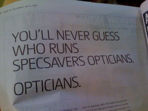
And no I don't mean 'how many businesses are run by opticians'.
The other day Tom saw some great big letters for sale on the internet. But they only had AEYVG left.
Being a Yorkshire man he thought it would be good to get the following:
On Friday I flew into the brand spanking new Terminal 5.
Seeing as you've asked my flight landed 10 minutes early, my baggage wasn't lost and I didn't feel the need to swear loudly at BA staff. But this a graphic design blog and not Lonely Planet, so onwards and upwards with the infographics reviews.

I flew in from Romania and funnily enough when we were there we cited infographics as a huge trend in graphic design right now. The new T5 is full of them.


Already they look dated. They're not brilliantly designed and they just feel dated (all those silhouettes?). Surely the information will date super quick too? (Imagine if T1 said "we're the only building in Great Britain to have two escalators running side by side.) There's a lack of future proofing there. Plus - who cares how long the baggage conveyor belt is?


There's even a whole infographics pod!
I know this kind of information (how do I get to Central London etc) is very important. But it seems they got a little carried away with the screen and the use of English over symbols. It all looks very futuristic, but it isn't. Look at the amount of text on those screens. And as far as I could see the screens stay static.

The spaces are huge and the signage is small. Shortly after being told off for taking this photo I got told off for walking into the crew Passport Control area. If only they'd seen my bottle of Evian I could have been in real trouble.

Those yellow and black signs, are they official airport signage? I seem to recall reading that they were. Is that right?
They work and they look good, but it all feels a bit hospital. A bit too official. There's no wit there, which would be fine but then they're not functioning that well either. They're like new versions of the old signs. No one has taken the opportunity to rethink the signage they've just carried on as they were before.
That sums up my whole feeling about the airport really, it's a version 2 of what's been before. Nothing new, no big leaps ahead. It's a cleaner, bigger, shinier version of T4. Which seems like a huge opportunity missed.

More Connect. It occurred to me the other day that Flickr display pictures within a set as squares and they only show six pictures across. So if I could lay out a Connect game that was six squares wide and photograph all of them individually... Take a look at the set here. Not the individual pictures, but the whole set together.

This holiday we played Connect, Ken Garland's brilliant board game (card game?). If you're a graphic designer this is about as good as parlour games get.

I don't know about you but when I see a collection of shapes and lines like that I instantly think - could I make an alphabet out of that?

The Os are normally easy. And seeing as this one is based loosely on a digital style grid the U is pretty easy too. And the N.

The M isn't quite as elegant, but it looks cool.

The connect game doesn't only consist of three lined squares though. And to be honest all these letterforms remind me a bit too much of the Mexican Olympics and all those Helveticalovers. You know the type.
So this M is a little more fun. And more appropriate for the game.

But making a full alphabet is hard. And it's a bank holiday weekend. Easter weekend. So back in the box they go. Until another time.

Still, at least I got enough letters to make COMMUNE.


Next week Kingsley and I will be honoured to be going back to Romania again. We're helping judge the Filter design competition for the second year running, we'll be giving a little talk and we'll be running a workshop. Razvan has started calling us the 'Godfathers' of the competition, which is pretty cool.
I really should have written about this before but I haven't got round to it. Filter is organised by the guys at Oricum. You'll probably never meet a more energetic, committed bunch of people.
A few weeks ago they had Dick Powell out to present. Doesn't that hall look gorgeous? It's the same place we presented at last year, the National Theatre.
Anyway. If you want to know more about Filter get in touch with Razvan or anyone at Oricum.

Are there any London designers who will be in Manchester on Tuesday?
A mate of Famous Rob's is organising a North vs South debate and needs some people from the London team. If you can help, leave a comment and Rob will get back to you.

Here's a nice little idea. No big fanfare, it won't win any awards, but I just saw it and thought it was good.

If you're out and about. At a friends house for dinner or sommits. And you think think, ooh that was a nice bottle of wine I'll have to remember what that was called. Except you won't remember, because you're a bit tipsy and you've got better things to be remembering.

Now that problem is solved. You simply tear off this little reminder. I always thought those notices you see in Universities with the little tear off strips cut into the bottom were a brilliant idea. It looks like someone has adapted this for Oxford Landing. I could imagine innocent using this. I bet people would collect those little labels.
In fact, that's one of my favourite types of ideas. One that just builds over time and then gets adapted by a business or an organsiation. A bit like those paths people make when they take the direct route through a park, rather than the badly designed route the developers have made. But that's another post.

I've always believed this. As you get older you don't get better ideas you just get better at getting them from your head on to that bit of paper in front of you.
That's why experience often leads to better execution and the youngsters often have more ideas.


Recent Comments