


Everyday bad usability from the fantastic Flickr Group, the Bad Sign Brigade.
All pictures are obviously from the Flickr group. Usual stuff applies.
Everyday bad usability from the fantastic Flickr Group, the Bad Sign Brigade.
All pictures are obviously from the Flickr group. Usual stuff applies.
I'm not sure if everyone already knows this. You may not even want to know, but someone told me recently and I wished I'd been told sooner. So now I'm telling you.
Let's say you're working on one PSD. You've got several other images in PSD's that you need to bring into the main PSD. Portraits into a web page design, for example.
For this design all portraits have to be 100px x 100px, but your image is, say, 120px x 180px. So you've change the canvas size in Photoshop and you're ready to go.
Here's the portrait you want to bring into Photoshop. It was an oblong but you've changed the canvas size and now you're ready to drag it across.
When you drag the layer into the main PSD it comes across like this.

Ahh. That's the wrong proportion.
Why? Because changing the canvas size doesn't automatically crop the image. So you're still left the 'waste' bits of image around the side.
Here's a better way of doing it.
Resize the canvas as before - especially if we know our image has to be a predefined size like 100px x 100px and we've got several of them to do.
Then select all.

Then crop. This will get rid of all the 'waste' around the edges.

When you bring the image in this time, it's free of all that crap around the edges.

There you go.
I didn't know that, and now I do. I thought it was useful. I'm sure there will be an element of me teaching you Grannies to suck eggs, but did anyone find that useful?
In case you're wondering, the screen grabs were taken from this minisite we designed and built for the wonderful Carmen Jones show at the Southbank Centre.

Apple want you to share your iPhone stories with them.
I will be intrigued to see if they do anything interesting with this.

Some fantastic info graphics over here at Similar Diversity.
Info graphics? Or are they just graphics?
Anyway... characters from the main religions are aligned alphabetically, Then their name and arc size is calculated from their total word count in all the books and loads of other stats...
What's even more surprising is that my old friend 'Scratch' Sagmeister was involved. All this found via the excellent infosthetics.com
Back in February we popped up to Glasgow to spend some time with the Graphic Design students. One of the pictures I took on that day, which was posted to my Flickr account has just been used to represent Glasgow School of Art's nightlife in an online mapping thing.

My picture is the orange paint on the floor thing, top right.
From what I can gather Schmap takes pictures from online sources (fully credited) and creates content for maps. It's a nice little idea with a terrible name.
Whilst we're talking about maps have a look at Poke's build your own guide thing for Dorling Kindersley. It's good.
The internet, just swilling around, looping through the air whilst you go about your daily business.

I've only ever had one guest post before and that was from the unstoppable Marcus Brown.
Here's another one. Tom, one of my partners at TDC, went to see The Haçienda exhibition in Manchester last weekend and I thought you guys would like to read a little review and look at some pictures.
- - - - - - - - - - - - - - - - - - - - - - - - - - - - - - - - - - - - - - - - - - - - - - - - - -
The Haçienda: Urbis Exhibition Review
It all started with my sister, like all people with an older sibling, they tend to dictate what we grow up listening to. Being 2 years older, she was always first with fashion and music. The 80s were a pretty special time - and Acid House was my Punk. My sister had the DMs with big safety pins, oversized secondhand jeans and Smiley Face tees. She also had a boyfriend who was very into the scene, bought all the records, and took turns on the decks at the local sticky floored nite spot, and went to the Haçienda.
I was 15 when I first heard about the Haçienda - that was 1988, the 'Second Summer of Love', everyone had smiley tee's, jeans were getting baggier, mens hair getting longer and the sun kept shining. I struggled to get into most clubs locally - I looked so young even with fake i.d. they turned me away! I was never asked for i.d. ever to get into the Haçienda, once when being searched at the door, a bouncer took my passport (my i.d. for the night) from inside my pocket... "Alright son, where you off then, on yer 'olidays... Ha ha ha".

Walk through the world famous Fac 51 doors at the Urbis exhibition and you get a really good display of what the Haçienda was all about, grouped both chronologically and thematically, it contains just about everything and anything from the history of the club.
There is a really great family tree which links all the people and events back to the club.


Previously unseen video footage showing the construction of the club, alongside a giant print of Tony Wilson, Peter Saville and Alan Erasmus, a small amount of early Factory items, setting the scene for the Haçienda, and the visual style of the club.
You then get a great slice of design through the years, with early sketched visuals through to art work and finished items.

Alongside the 2D items, there are numerous videos to view - a whole room is The Fall in performance, as well as original scratch videos by Claude Bessy and Swivel.
One of my favorite items displayed had to be the 'original' neon bar sign for the Kim Philby Bar.

I thought I knew all the design done for the Haçienda, but I found items I had never seen, one of which was the all gold poster for Haçienda90 - a lush print of gold on gold, no copy other than the title...


Also featured are light boxes with Madonna's first UK appearance, a wall of logos, axonometric drawings of the club and lets not forget - FAC51-Y3 The Haçienda 25th Anniversary trainers designed for Y3 by Peter Saville and Ben Kelly.

The exhibition also traces the impact the club had in shaping the economic and urban development of the city.
A final, nice tough was the graphics and items that were created for the crew working on the film TwentyFourHourPartyPeople - Crew tees, invites to after show parties and viewing of the premier.


More pictures:


I want to talk about Interesting 2007 for a bit.
Not a review, not a discussion about the effect on the global conference market, just a few observations on the graphic design project.

I guess we've all done work for friends or friends of friends. We certainly have here, and almost every time it's gone tits up. Or at the very best it hasn't gone very well. This was a big concern of mine when Russell asked us to help out with Interesting.
It's a fantastic project, really intriguing. But history tells us to avoid these projects like the plague. They always go tits up.
This one didn't. In fact, I think it went rather well.
So why is that? Although I don't really know; several reasons spring to mind. Possibly Russell is more used to working with designers than previous friends; although we've worked with people who have worked with designers before. From the outset we agreed a budget of zero; I think this is important, as free is very different from cheap. You can't beat quite good and free as someone once said.
On to the brief. The hardest part of this brief was to create something when nothing was really needed, in the traditional sense anyway. For a normal conference you'd need brochures, adverts, banners and all sorts of other bumpf. Interesting didn't need any of this. The tickets were already sold out before we started working on the project.
Yet we still needed a 'look', we still needed a visual language and Russell needed some images to stick on the blog from time to time.
The second hardest part was to make it genuinely interesting. Interesting by actually being interesting rather than by trying to create interesting. Interesting without being messy and incoherent. Interesting without getting sick of the bloody word interesting.
Harder than it sounds.
![]()
This is the little logo type we created. A proper old fashioned logo type. It's not a typeface (it was hand drawn) it's not a blurry symbol. It doesn't change colour. In fact it doesn't change at all. It's a mark.
It's deceptively simple, and at first it doesn't look that important. But look how hard that little fella worked. It was used in black, in white, and reversed out of a square. Just sitting there, not getting in the way, communicating clearly.

It worked on almost every colour known to plastics manufacturers, it worked on record sleeves, tshirts and lots else. (If 'lots else' is valid English.)

Our studio during an intense bout of screen printing.
Lots of interesting, exciting things happened that we didn't expect or we didn't predict. Early on Kingsley spent a day at home making screens and he emailed them into the office.

Just great little images. The logotype quietly sitting there.
One day Razvan popped in and helped us take a few pictures. We were constantly testing the screen on different substrates. Out of habit, I uploaded all of these pictures to Flickr.
And then Russell started using them in blog posts.

This is what I'm going to call the visual language spilling out (because I can't think of a more sensible expression to describe what I mean). It's all there, you recognise it as Interesting 2007, it all fits, it's all on brand... and yet there's no big identity manual, there's no brand manager, there's no marketing plan.
Quite close to the big day Dino rang and donated 350 CD's of a mix he'd made. It seemed appropriate, interesting and (sorry) on brand to reuse 7 inch singles. We bought 250 odd from eBay for about £5 and we traded the rest with our friendly local Oxfam manager. And so Tom and Kingsley created this fantastic CD holder. Here's that logotype again, just sitting there, not getting in the way, communicating clearly, adding to the thing.

One aspect I found really interesting - as well as the 'official stuff', the tshirts

the bags and the CDs;

was the visual language spilling out into the day and into the far reaches of the blogosphere.

Link: http://chrisbaylis.typepad.com/blog/2007/06/10_things_i_lea.html

Link: http://www.flickr.com/photos/rooreynolds/565396028/in/pool-interesting2007/

Link: http://www.flickr.com/photos/russelldavies/580755240/
Here's Matt sporting the logo on his presentation and wearing his tshirt. Bonus points for that.

It's all there, you recognise it as Interesting 2007, it all fits, it's all on brand...
What's interesting for me as a designer is how the visual language seemed to take on a life of it's own. Even within our studio. Without instruction it spread in a way that was always totally appropriate. The designers biggest fear when having anything less than 100% control is that everything will look shit. This didn't happen, in fact I thought the randomness of the substrates, blog posts, Flickr pictures added to the richness of the project. Which was the idea, without being the idea. If you see what I mean.

Russell and I had talked before about big brands allowing their logos to be remixed and allowing people to create their own versions of logos and graphics. I doubt if that will happen anytime soon, but I think there's some really interesting lessons about control here. It would be nice if a brand could create a true spirit or a 'way' for the graphics (not for the brand, but for the graphics) that was then allowed to be taken and interrupted by consumers, users and people. "You are more than what you have become" as Mufasa says to Simba in The Lion King.
There's also something very interesting about the reusing aspect. We didn't produce any new stuff. We added more value to existing things. That's not easy to do well or to do seriously, but when it comes off, again, it seems to be more than the sum of it's parts. Surely that's what a lot of branding is about today? Becoming more than the sum of your parts?
It was genuinely rewarding to see how chuffed people were to collect their tshirts. If you're a graphic designer you don't often see that sort of reaction to your work.


This is Dan Burgess' tshirt.
I hope there's a brand (a big, high street brand) that could adapt some of these principles and build something big and powerful without micro managing it. Surrendering control and gaining influence and so much more.
I find it interesting how green stuff is entering the language of children's toys.

There's this Reduce, Reuse, Recycle Tonka truck and just in case you hadn't noticed Bob is building an Eco town.

It's called Sunflower Valley and he's taking some old land and building lots of eco-friendly new homes. He's reusing too.


This isn't just one story - it's the whole rasion d'etre of Bob The Builder these days.
Every book, magazine, website, plastic toy or DVD is based on the Sunflower Valley story. And there's loads of different green aspects in there. It's pretty comprehensive. 
Remember how that guy on Radio 4 said that the main recyclers were "children up to 14, retired people and Guardian readers".
In a funny way this all reminds me of When The Wind Blows, the Raymond Briggs book about impending nuclear disaster.

Which is possibly a bad thing because all that nuclear, CND, Cold War stuff now seems like another campaign 'thing' that was terribly important at the time but just faded away as the world raced past in another direction. And we wouldn't want all this green stuff to end up like that, would we?
At the same time 'green' also reminds me of the anti-smoking movement. Richard is always banging on about how the marketing services industry got left behind there and I don't seem to remember the entertainment industry (Hollywood or Children's books) ever taking a strong anti-smoking stance.

But then, graphically the 'green' movement doesn't have any recognised symbols to rally behind. Although, strangely, in branding terms they already own a colour. Notice how that Tonka truck was green. Have you ever seen a green bin lorry?
So maybe it is bigger than a 'campaign'.
No real conclusion to this. Just some thoughts stored in cyber-space.

Don't spell check your notices either.

Wonderful from Edwin Tofslie.
(Typepad still insists on cutting all my images off at the side, even though I have the column width set to 500 and the picture size set to 500. How annoying.)
Last week I was in America. I thought I saw a lovely, simple, classic, 'back to basics' can of Coke. Turns out I was right.

Gorgeous, isn't it?
Someone at The Coca Cola Company came to their senses (probably Coke's new North American design director Moira Cullen) and they've changed the can back to this classic, iconic design. Coke has a rich design heritage and should be a brand that's as revered as Volkswagen or Knoll. Should be, expect until last week it churned out this shit.

All Coke can images from Coke Can Gallery.
This is part of what Richard Williams brilliantly calls the "add more steam school of design". You know the type of thing, when they redesign a frozen meal and they make the carrots a bit more orange and they add a bit more steam to the photo.

Picture taken from Chris Hester. Usual stuff applies.
Coke has gotten rid of all this. This month's Creative Review carries an article on the redesign and they say, "No more bubbles, no more drop shadows, no more extraneous detail". Well, thank fuck for that.
Except there's more to it than this. The can now features only trademarked elements and the decision to go with this design was influenced by "modern print techniques that can produce very strong solid colours on the cans". In the age of the design remix and with IP being rightly heralded as the future revenue model for designers Coke has found that the original design still achieves stand out and clarity.
Designed by Turner Duckworth, Coca-Cola believed "by over complicating its visual identity and packaging, it had diluted its brand and come to look more like a generic soft drink". No shit, Sherlock.
The previous designs were awful, diluting all that heritage into an also run of mediocrity that you see so often. So often.
And this is why designers are (still) wankers.
If you Google Ben Terrett, one of the top results is a Podcast I recorded with Paul where I state that designers are wankers. Well, most of the ones I've met...
You see, designers are so often their own worse enemy (for the record I agree with pretty much everything Bruce says there). Bowing to clients worst requests, endlessly free pitching and constantly slagging each other off.
How did the Coke can ever get so far down this terrible design road? Who's at fault for those previous designs? The consumer? The brand manager? A bit, sure, but a lot of that blame lays with the designers. The guys that added more steam. More bubbles. More "extraneous detail".
Too often designers get tied up in the client forest unable to see the wood for the invoices and producing shit like the previous Coke cans. That's why every other soft fizzy drink looks the same. That's why WHSmith is a "haze of tit and bum and bright colours". That's why (most) designers are wankers.
(And by the way, this blog is two years old today.)

The alphabet made from those photos of looking up at buildings. Brilliant. Why didn't I think of that?
Via infosthetics.

Start off by reading Michael Bierut's facinating post on the design of the UN logo and then as William Dretnell says gaze briefly at Adam Bartos's photography book, but better than that, take a look at Anne's gorgeous Flickr set of pictures inside the UN.
All we need now is for Design Observer to link to Anne's pics and we have the perfect blogging loop.
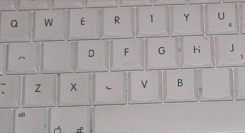
Which keys on your Mac have deteriorated? And why? Find out more and join in, here.
I finally got to see and use an iPhone. Here's my humble review.

Short Version
Wow. It's incredible. As good as you'd hoped.
Long Version.
Wow. There are three things that immediately struck me about the iPhone.
1. I picked it up and just started using it.
Playing with it, browsing the web, making calls, all without looking at a manual or asking anyone how to use it. Fucking hell it's easy to use. Unbelievably intuitive.
Everything just seems to be where you want it to be. Everything seems to move how you want it to move. Maybe it's because I'm used to Apple stuff, maybe it's because I've seen and read so much about the iPhone - but I doubt it.
The usability is incredible. Breathtaking.
If you don't believe me, think about the time you switched from a Nokia to a Motorola, or the time you switched from a Motorola to a Sony Ericsson. Was that easy? Or was it a little confusing using a new operating system? Finding the contacts - easy? No. Exactly.
This is a new phone by a company that's never made a phone before that does things a phone has never done before and it's possibly the easiest piece of technology I've ever used. That's amazing.
2. It's smaller and sturdier than I thought it would be.
Here's a photo of it next to my 5th generation iPod. I thought it would be bigger than that.

It's also slim and yet surprisingly sturdy. It feels slick and solid and good.

Here's a picture next to my stylish yet practical Nokia 5140.

And here it is next to a Lady Godiva. Another 59 of them and you got an iPhone.

3. It's so new and yet so familiar.
Partly because the usability is so great, partly because I've heard so much about it - it just feels so familiar. It almost feels old. Know what I mean?

It's strange but after five minutes of using it - something so new and so revolutionary feels like I've been using it for years. That's pretty amazing too.

Recent Comments